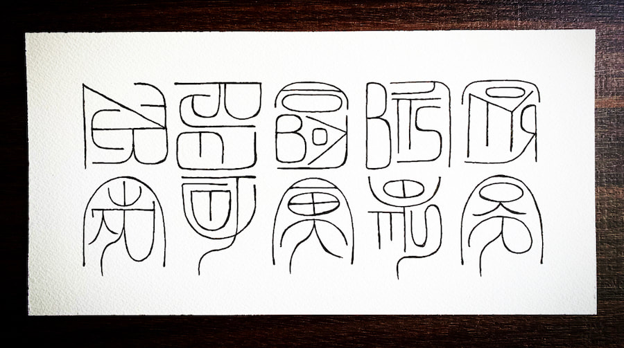
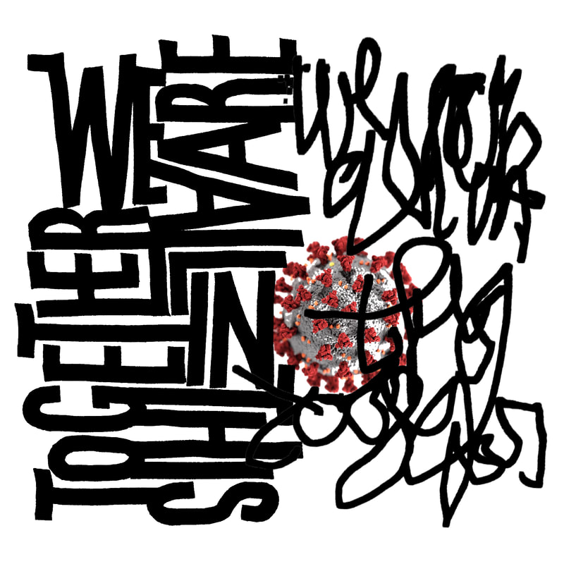
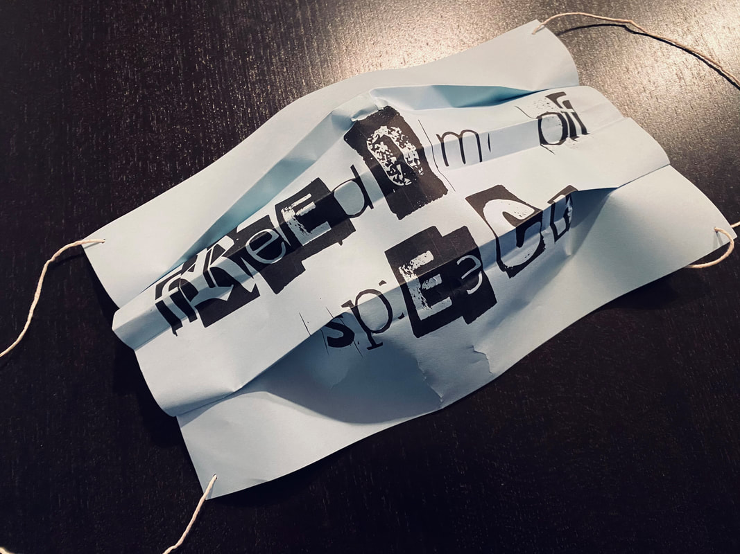
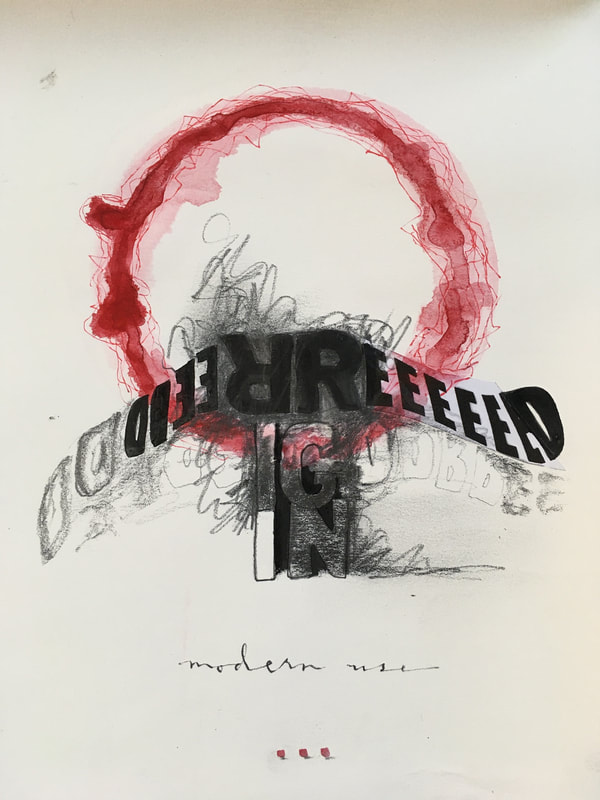
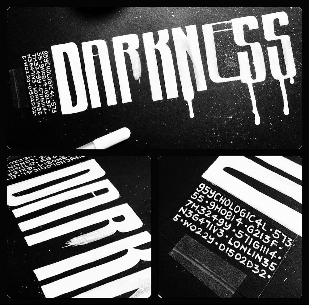
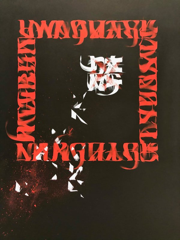
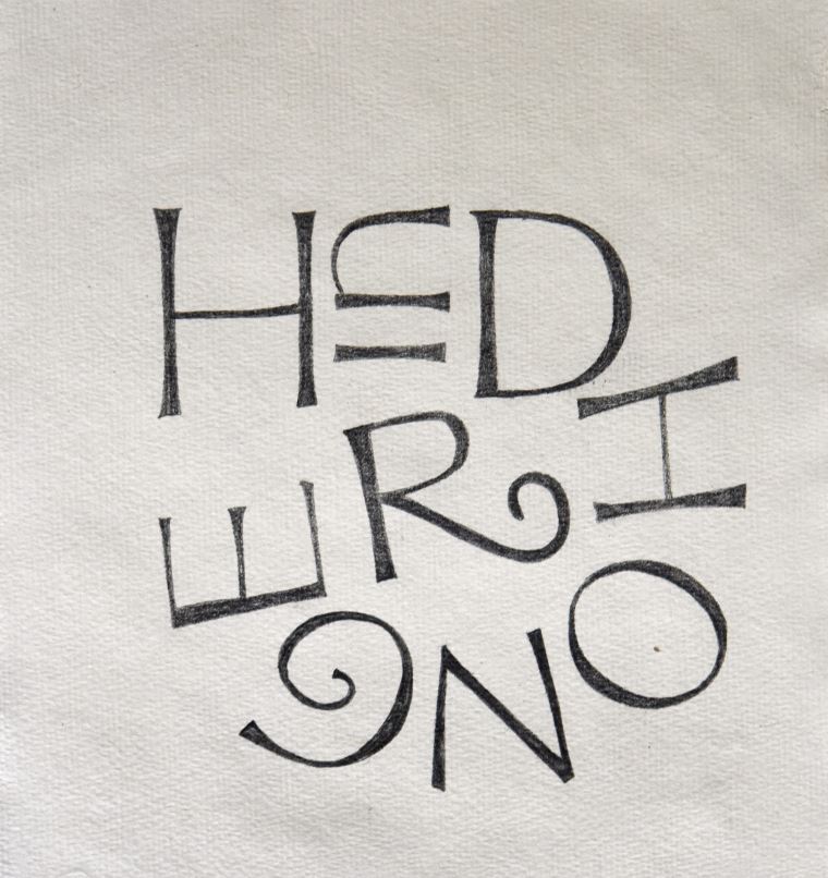
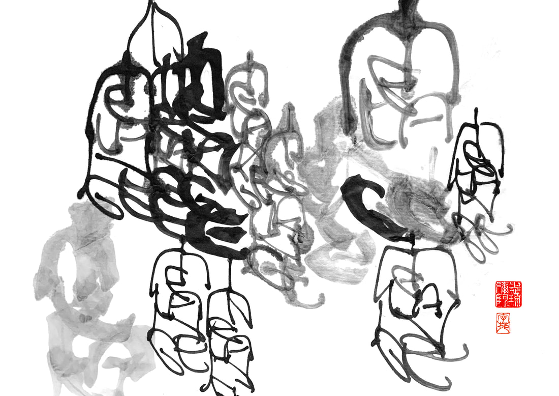
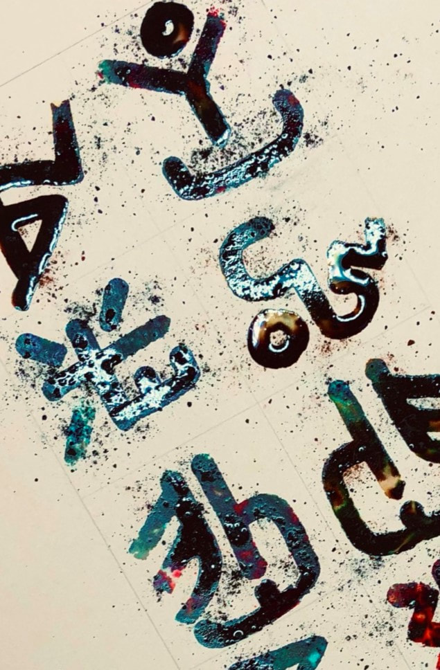
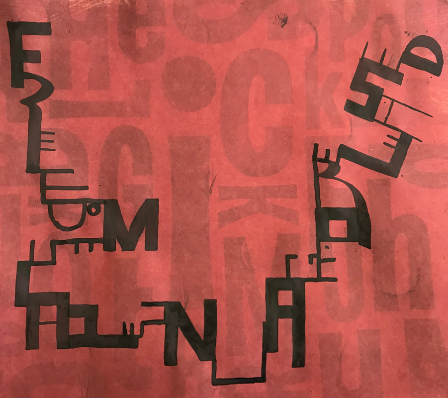
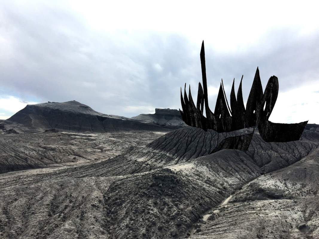
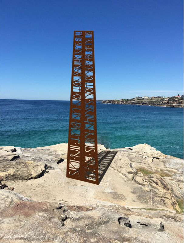
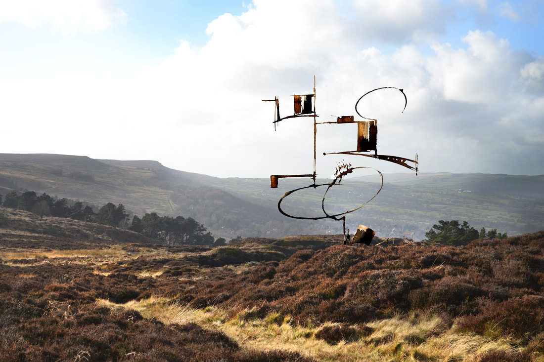
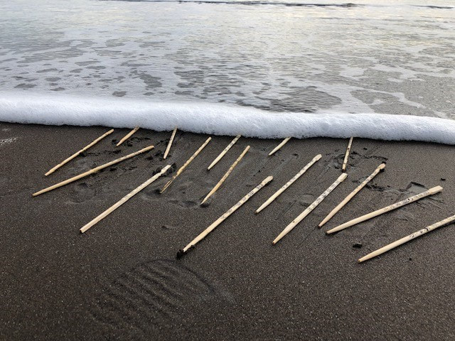
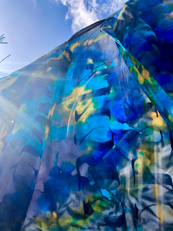
 Shiwan Cheng - never judge a book by its cover From Australia to America and across Europe and Asia, students collectively responded with high energy to the challenges thrown down week after week in The Brody Series. From conceptual art to Seal Script and Kufic, from textiles to metal installations, we shared techniques and skills across cultures and disciplines. Many of the students were polished calligraphers; some had done no calligraphy at all but practiced art in other media. Some joined because of their curiosity about the history of writing. Following his success in the BBC aired The Secret History of Writing, and during lockdown in the covid-19 epidemic, Brody Neuenschwander was joined by this group of diverse students for an experimental series of online workshops and ArtTalks. Ardington School shaped the programme of four workshops with Brody, designed to stretch the combined group thinking and output beyond calligraphy into ‘text art’ - for art’s sake. The sessions ran through December 2020 to February 2021. The results, in Brody’s words, were astonishing and pushed right over into the realms of art and conceptual art. In the final feedback session Brody told us that he had not seen students produce such amazing work before. This ‘Great Laboratory’ series of workshops produced such a remarkable portfolio of work that it has now been assembled into a series of three photobooks for all the students to enjoy and to be inspired by for many years to come. A downloadable montage has also been created for the students to print and frame wherever in the world they may be. We share a selection of the work, and a glimpse into the workshop content with you here, and hope you enjoy the journey we embarked upon. 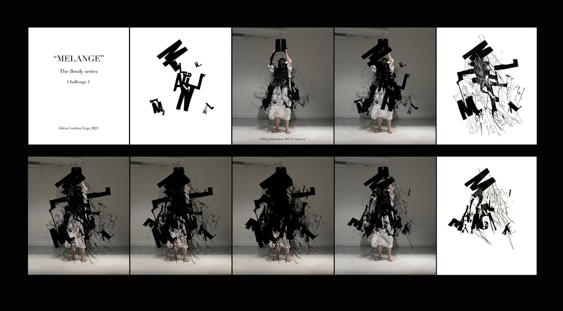 Silvia Cordera Vega - melange Session One – Conceptual art CONCEPT LEAD ART. WHAT IS THAT? ‘The choice of medium, format, and other visual aspects of work follow the decisions about the meaning, the idea, or the concept of the piece or project. Meaning can be a simple verbal statement but can also be a more intuitive sense of whatever the artist feels the need to explore’. During this first ArtTalk of the series, Brody explored how writing and text have long been considered as an art form in some cultures, and how this has evolved over the centuries. Chinese calligraphers, for example, view calligraphy as the supreme visual art in itself, more valued than painting and sculpture, and have done so since the earliest writing took shape. Brody reviewed examples of text as art from multiple cultures including some of the earliest Western works using Carolingian and Uncial from 800 BC, representing astrological (astronomical) constellations. We explored the unusual addition of freehand lines in the novel by Laurence Sterne published in 1759, where the author drew lines which were as convoluted as the twists and turns of the novel; the lines became the ‘shape’ of the story - but not in words as we know them. Brody also explored the work of more modern painters that have used text in their art, such as Andy Warhol – famous for his painting of Campbells soup cans among others. But in the main, Western art has failed to incorporate calligraphy into the sphere of fine art and we spent some time questioning why this might be. With this history and diversity as a backdrop, our throw down challenge from Session One was to create a piece of conceptual art that incorporated text and words in one or more forms. Students were given a wide brief and encouraged to use handwriting, type and calligraphy in a variety of media to express a concept. Many of the students submitted works in black and white. Some students were inspired to pick four words which told their story of corona virus, some wrote on face masks. Several students needed to improvise materials because of the lockdown and closure of their usual art suppliers. Others opted for animation and GIF files to tell the story. The results of this session showed how to give words their voice and how improvisation and good composition were key to producing successful conceptual art. A selection of student work from Session One follows below: Session Two – Comparative Calligraphy In this session, Brody gave us a behind the scenes account of the making of The Secret History of Writing. Brody examined Chinese, Latin and Arabic scripts, how they work, how they differ, and how each script made the transition to print technology. With reference to examples such as the Rosetta Stone, showing the transition from complex symbols into vowel-based language written in grid-like rows, onto traditional and simplified Chinese characters, we travelled right up to Xu Bing communicating through emojis (representing a universal language in images). Brody described the evolution of how knowledge has been captured in text form over thousands of years. 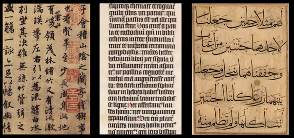 The elegance and beauty of the three comparative scripts above is evident. The meaning to non-readers of Chinese, Latin or Arabic however, is incomprehensible, and leaves them to simply admire the rhythm, density and proportions of the marks on the page. In the challenge from this session, students were asked to take either Kufic lettering (the preferred Arabic script for Quran transcription) or Seal Script (Chinese characters from the second half of the 1st millennium BC) as a design concept to produce a Latin based phrase. Brody demonstrated each of the letter forms using a variety of different calligraphy tools including a cola pen, an automatic pen, and his own design, a monoline pen. One of the criteria for students to consider was the careful placement of marks - how to design a new alphabet. This was not a gestural exercise, it was more of a construction challenge. The student submissions for this challenge ranged from simple black line drawn Seal Script through to full colour psychedelic interpretations using Kufic derivatives. Students created brand new alphabets including one that took on the playful shapes of Tironian notes, a type of shorthand dating back to 60BC. Brody used computer graphics packages to edit the composition, background and colours in some of the students work and we spent time as a group discussing what impact this had on each piece. Changing the traditional Chinese red chop for turquoise was done provocatively by Brody as a reminder that we should reflect carefully on how much of a bond we want to retain with the original inspiration in our work, and how much we can take liberty to blend styles across cultures. A selection of student works from Session two follows: Session Three – Brody’s own work and the ‘medium-shift’ We lifted the lid on a whole new universe of inspiration in this final taught session of the series. Brody showed us decades worth of his medium-shift work that goes ‘off paper’ and onto skin, metal, textiles, glass, sculpture, from 2D to 3D. Brody explained that he has always been interested in the history of writing on garments. In some cultures, the writing was used as an added layer of ‘protection’ against injury, written onto garments worn underneath battle armour. The written forms slip from flat in the creation to sculptural in the wearing – a sense of movement that cannot be achieved by simply working on paper. Brody presented examples of sculpture with writing on the body from as early as 3000 BC and shared his own contemporary interpretations, using plaster made sculptures over metal armatures, covered in hand written thoughts and his own stream of consciousness. The mechanics of Brody’s medium-shift work are complex, as we found out in this session. Nibs, ink and paper are easy enough tools to get your hands on, but when you move into the realms of performance art and works of this scale, the kit list becomes less accessible. Brody showed us the moving table he designed and built, operated by a crank and special screw that enabled a static camera to film his writing in action. He showed us the heavy laser-cut metal panels that now encase a chapel, as well as the supported sculptural pieces that took weeks to hammer into shape using moulds. He also confessed that without the wonderful Thierry (his builder-engineer extraordinaire), some of these installations may never have happened. More builder than Brause, more crew than quill with these medium-shifts. And the challenge after this session was for the students to design either a metal installation for a public park (ignoring any of the usual health and safety restrictions just to make things simple!), or a kimono following a garment pattern that he supplied, or any other off-paper work that they chose. Students could submit a mock up of their design, or execute the full design. Here is a selection of submission from Session Three: This was an extraordinary series of sessions, in extraordinary times. It left me with a sense of purpose – working together with such a diverse group to create personal responses to each of the challenges and to compare, observe and learn from others work. It was a privilege to be a part of it and I’m grateful for everyone who joined us and of course, to Brody for being our guide.
The copyrights for all works in this article remain with the artists.
0 Comments
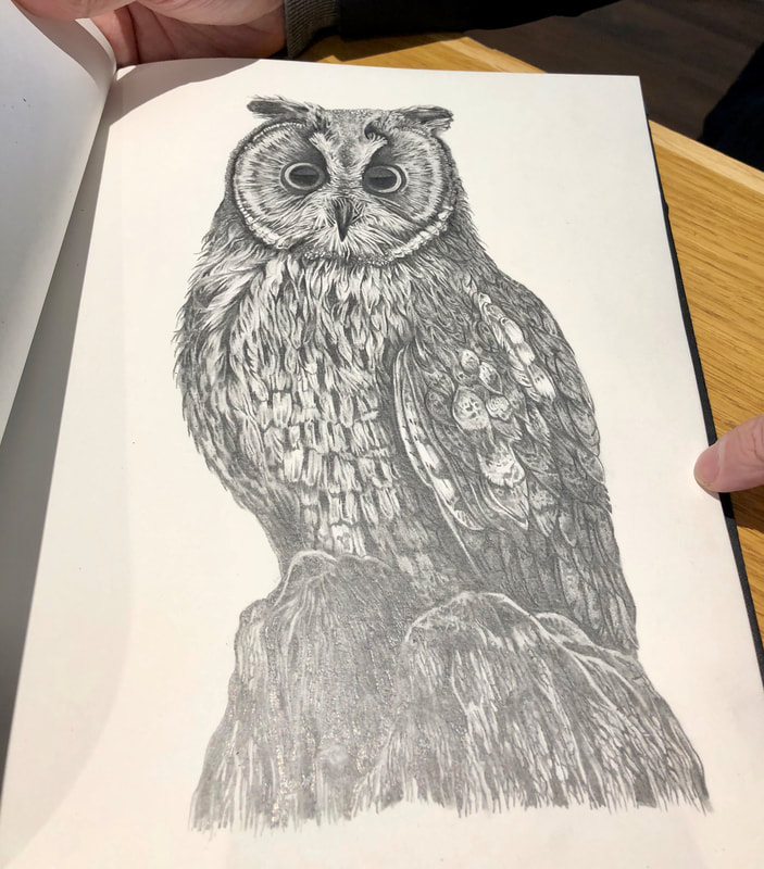
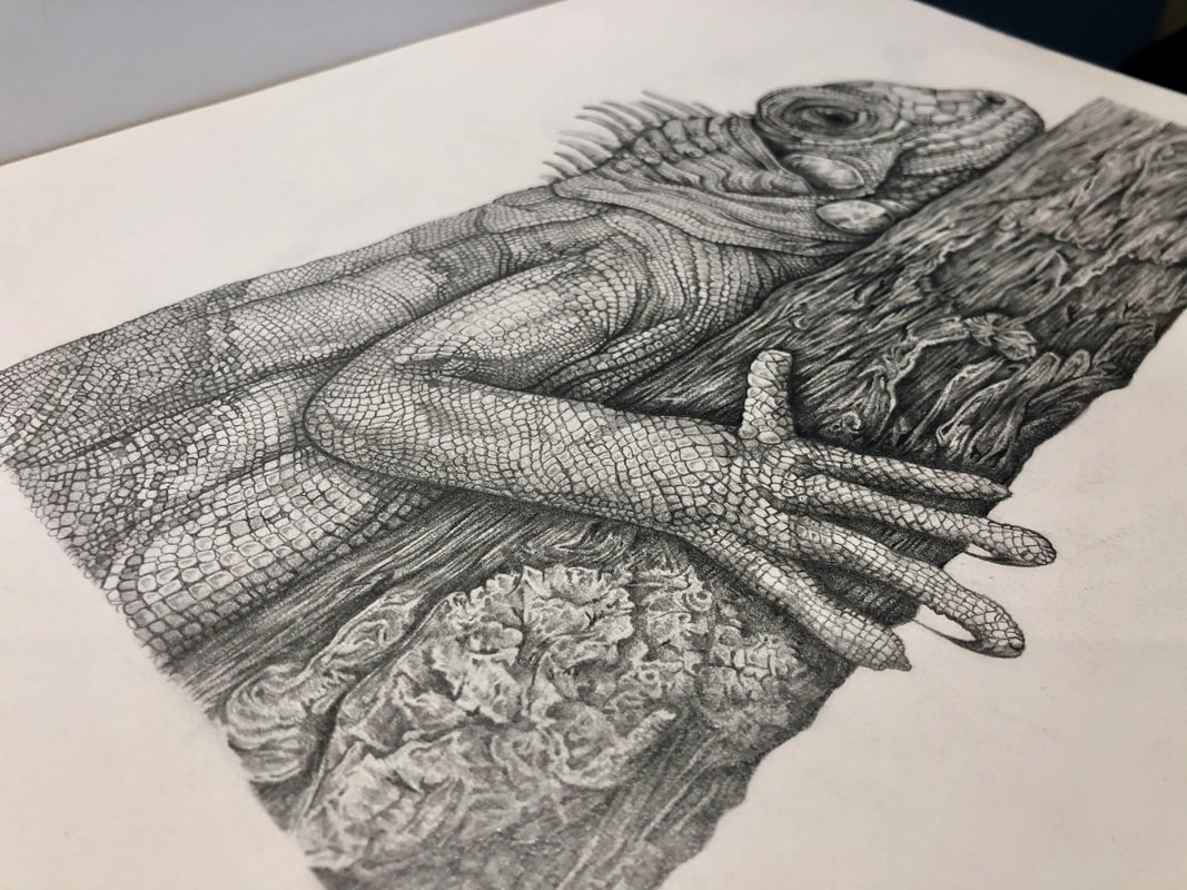
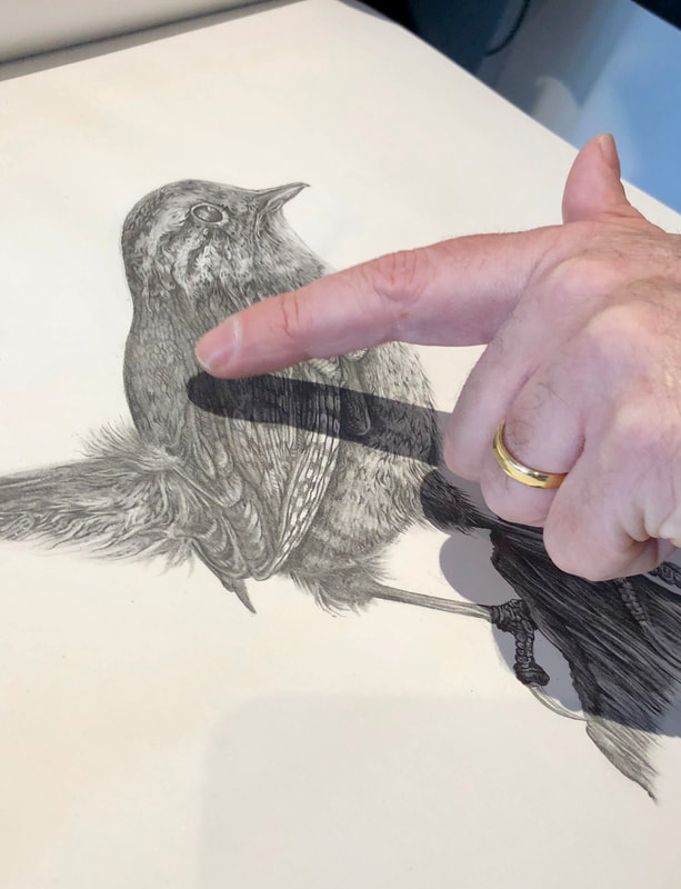
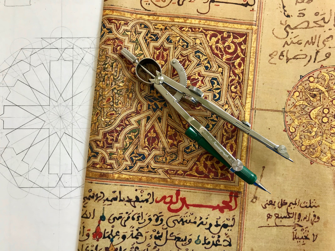
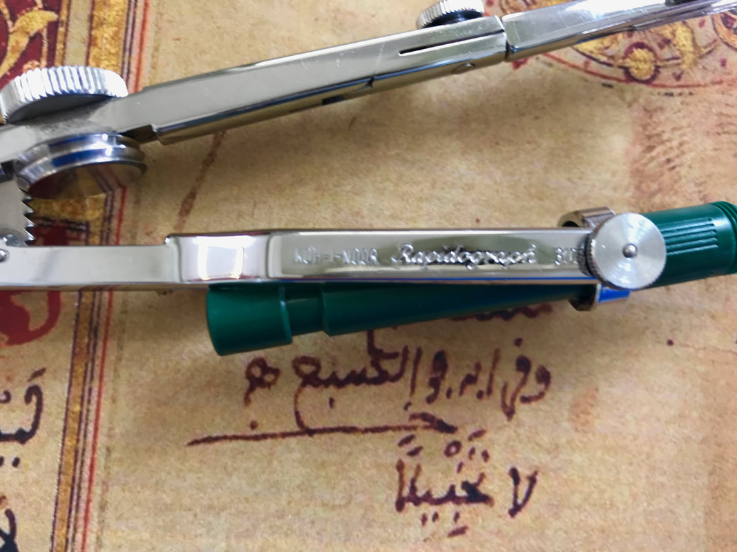
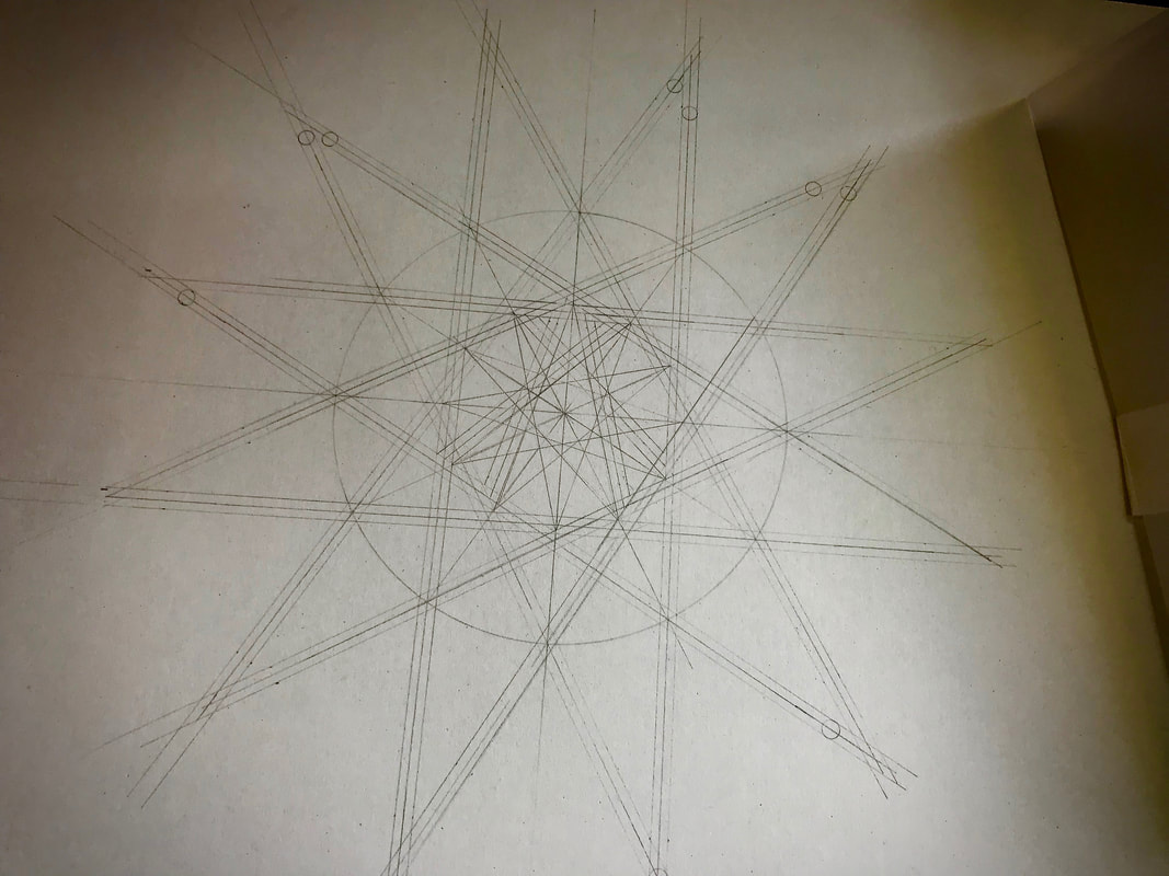
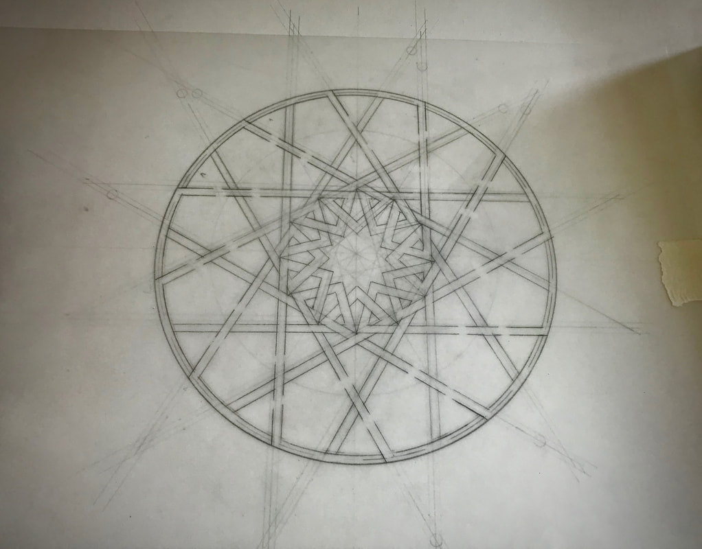
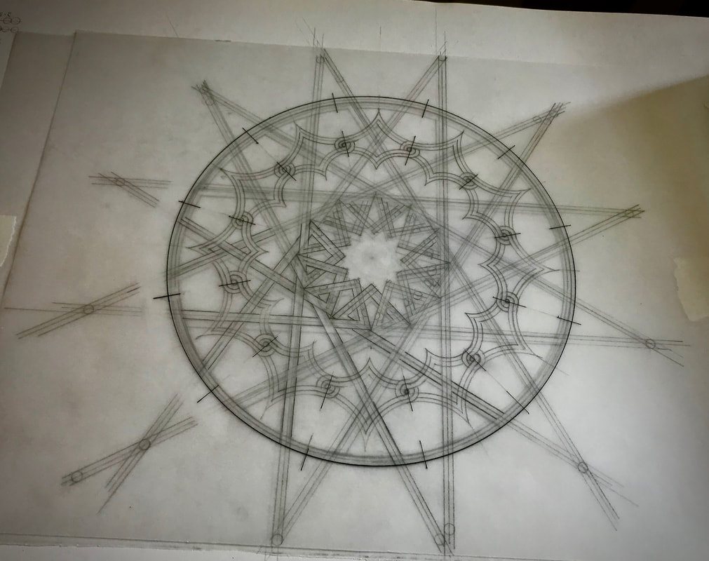
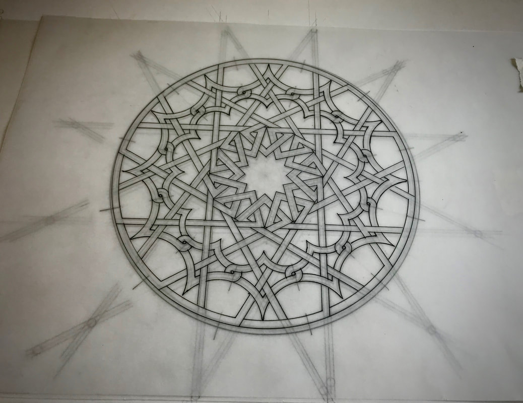
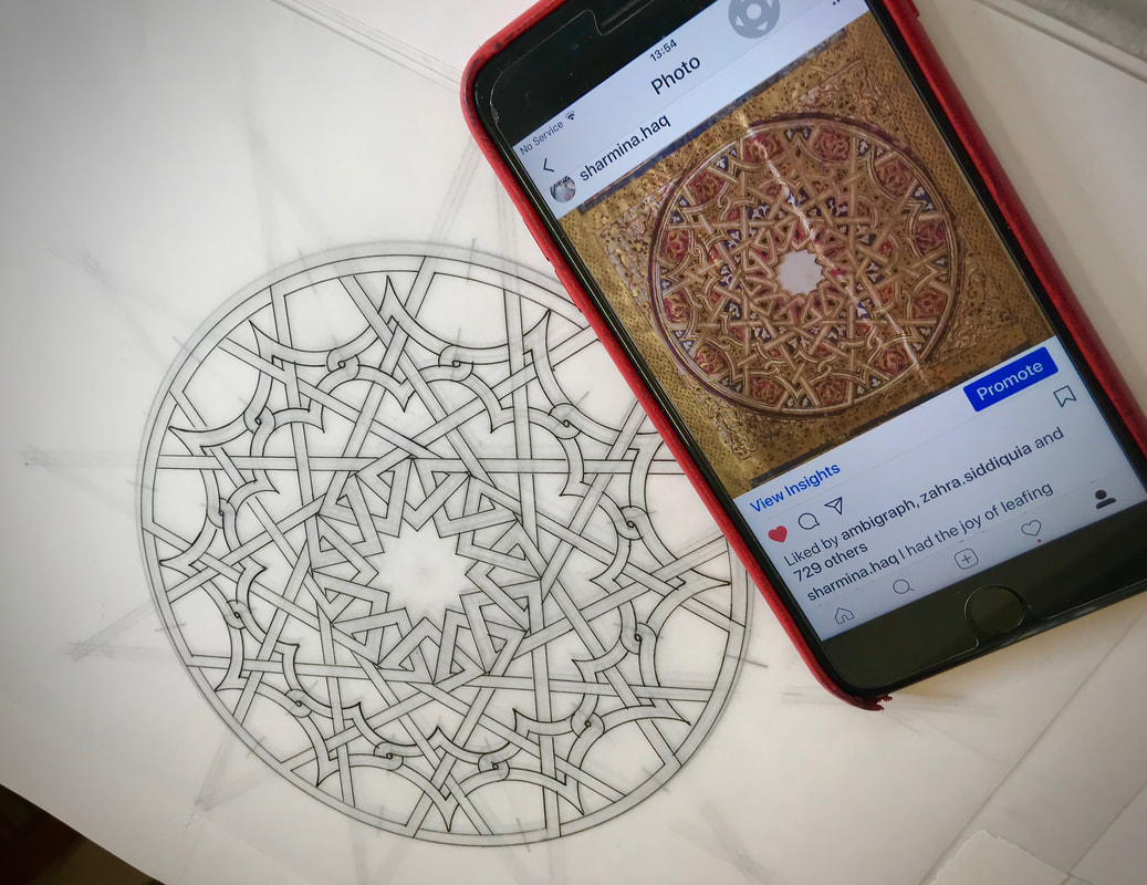
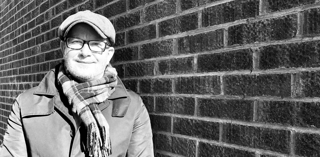 New tutor, Clay Thompson, has plenty of experience to draw on. In his day job as a designer of trading software (user experience platform design for an investment bank), Clay commutes up to London most days and this gives him some quiet time to draw. Nearly all his drawing is currently done on the train. But this wasn’t always the case. He grew up in Canada and has been free hand drawing birds and animals since he was just 3 years old. Calgary was so cold and he used to visit the Winter Gardens - like a mini Eden project - which was full of wildlife subjects. Clay laughs and says “I felt like the strangest kid sometimes! But my Grandmother was an oil painter and when she set up an easel, I’d watch the empty white board and the chemistry she mixed up on her palette and a picture would just emerge. It was magical.” Clay spent a lot of time with his grandparents and these early influences stuck fast. Clay’s design career started when he left school and became a commercial artist and illustrator. His apprenticeship was in airbrushing and began in 1987. These were the days of real paint, not digital airbrushing. Macs were really expensive back then and there was no such thing as Photoshop. He spent most of his time drawing and preparing illustrations, and then moved into a visualisation role. Basically this means if you are producing a new product, Clay would sketch out what the physical thing might look like. You might just recognise some of his amazing work in the following images: He also designed the 2002 World Cup corporate marks, seen by about 4 billion people for the Korea Japan FIFA world Cup. Clay worked on these images for about a year in total, which started 3 years ahead of the world cup. Clay now mentors many young designers, and teaches drawing to groups of colleagues at work. His approach is relaxed and supportive. “You have to get people comfortable with just making marks. There is no judgement in art in my view. What people think has little relevance to the process. For me it’s more about how does this make me feel when I am doing it. I’m all for getting people to enjoy the process. The destination is not the main event – drawing is about answering questions – how do I make this 3D thing 2D? It’s also a form of meditation and a way to switch off while I’m commuting.” His work is now mostly in graphite (pencil), and this is how he will be teaching his first course at Ardington in September 2020. Clay uses a Derwent mechanical pencil, (0.5mm) and works in layers, laying down all the tonal layers first and then uses a putty rubber to remove and lift off the highlights. Then he goes back in for the detail. There are maybe three layers in total and he works across the whole piece rather than being too systematic. Interestingly, Clay works mostly from memory, simply laying down some negative space at the start from reference material and then the rest comes from his memory of the original detailed observation. You can see just how fine is the detail achieved in some of his latest work below: What’s next for Clay? “I want to do something with my art – I’m aiming at being more commercial. When it’s your day job, the joy can go out of the discipline. But I’m now enjoying drawing every day and it’s on my terms – doing subjects that I love. I would like to do a series of British wildlife as there are so many amazing British animals that people don’t get to see. It would be great to do a collection and start selling them.” If you would like to draw on Clay’s experience as an artist, illustrator and designer, we are delighted to invite you to sign up for his class – simply click the button below to read all about his upcoming two day workshop. 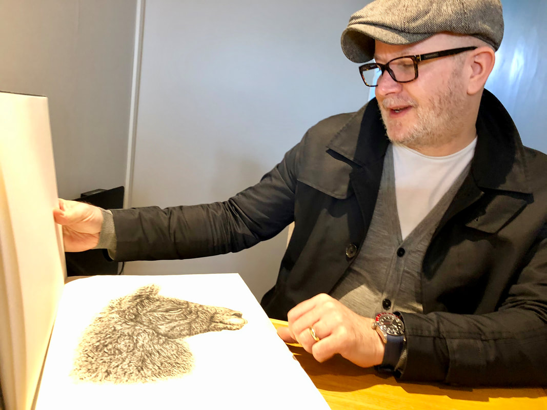  Sharmina’s work is exciting and different. She sells her work as paintings, often inspired from tile-work or Koranic manuscripts and undertakes commissions for people who want to have something specific represented. Using gouache or watercolour (which Sharmina prefers because of the movement and depth) in the final design, Sharmina aims to ‘decode’ original geometric patterns and art. She recreates them with extreme precision, using compasses and mechanical pencils to achieve the first draft. Watching how Sharmina works you can begin to understand the enormity of the task of decoding an original ancient design. Sharmina likes to analyse historic traditional patterns and build up a design based on them. Once the design is developed it can then be painted on wood or tiles, paper, glass or on plates and pottery. Sharmina has a maths background and is naturally interested in how patterns are formed. Decoding a pattern, like the doorway of the Blue Mosque in Istanbul, was around one day’s work to prepare the original geometry. Her favourite design however, is from a manuscript which she first saw in an auction at Christies and then was fascinated into how to replicate the design. See below a series of photos which show how this particular design was built up. |
Blog categories
All
Author:
|


 RSS Feed